The Overlooked Performance – Visit 1

  • Date of Visit – 24/3/15
  • Venue of Visit – St.James Cavalier, Valletta
  • Photographer – Alex Attard
  • Curator – Dr.Vince Briffa
  • Title of Exhibition– The Overlooked Performance

alex_profile_pic_squareThis exhibition was about the progress of Renzo Piano’s work in the Valletta City Gate and the new parliament. Alex Attard has been overlooking the construction of Piano’s work and noticed the workers’ behavior and the way they worked with different tools and materials and the effect they left on the building itself.

DSCF1674

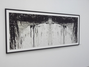
 Proscenium #1

DSCF1676

Proscenium #2

This is a photographs of the old Valletta City Gate where the photographer used a type of software to manipulate and edit this photo int an inverted image. Obviously in this print, we can see the negative and positive spaces. Although it is edited from the little detail that it has we can still see the architecture through the white space. In my opinion in this artist’s photos there is a similar influence from the Japonism prints.

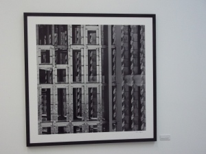
DSCF1641

Circumstance and Articulation #1

In this print I am seeing two layers of images manipulated together to create one composition. On the left hand side I can see a zoomed part of the construction of the new parliament that is in the process of being constructed. On the right hand side I am seeing the finished work of the parliament. The photographer took the photo when the light came from the upper right direction. The photographer didn’t just take a photo, he chose to take a photo of these geometric shapes in the architecture and construction of the new parliament in order to create an innovative composition.There are also negative and positive tones that compliment the print.

DSCF1663

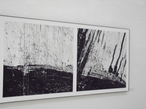
Poiesis

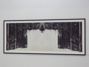
In this print I can observe and analyse that these detailed architectures that have an inverted effect that has negative and positive spaces. The artist added some splatters in black with the manipulated photos to create an abstract composition but at the same time it has a link to architecture.

DSCF1687

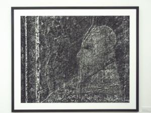
Fragment From History

In my  opinion here I am seeing a rough texture texture of black background that could be a photo with a rough texture effect. He selected dark areas and light areas that with these formal elements he created a composition of a human figure through a portrait view. The figure in this image is looking at a specific direction. The artist could have been influenced from the rough textures of the architecture and construction to create this piece.

DSCF1694

A Matter of Perception #1

Scan_20150409 (7)

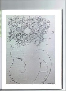
The Explosion of the Brain Series, Javier Joseph Formosa, 2013, Pen on Paper

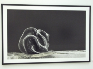
This print shows a zoomed photo in which we see the detail in the architecture that when I observe it I see a lot of organic forms that are creating an abstract ‘human figure’ in the fetus position through the creasing of this form. This reminds me of the works of Javier Joseph Formosa’s ‘The Explosion of the Brain’.
Neville Brody

Neville Brody is one of the best graphic designers of his time. He began his studies at the London College of Printing and first became popular through his work on his cover design and the work he did in the British independent music scene in the 1980s. When he was the art director of Fetish he began to experiment with the start of a new type of visual language that included visual and architecture elements. Later he used these ideas and set new examples through the innovative style of The Face magazine throughout the years of 1981 and 1986.

Through his work on magazines he became established in his reputation as one of the world’s best graphic designers. His work on The Face magazine revolutionized designers’ and readers’ attitude towards the medium. He later created his own typefaces into his design. He also broke boundaries in his work on FUSE. When he worked on Arena through 1987 and 1990 he completely changed his style, his work was minimalist, non –decorative typography and made his work simpler. He founded The Studio in London in 1987.His work was commissioned by big organizations like Berlin’s Haus der Kulturen der Welt, Greenpeace, Japanese companies Men’s Bigi and Parco, the Dutch Postal Service, the German cable channel Premiere and Austria’s ORF TV channel.

Neville Brody’s work is currently based on electronic communication design. But at the same time he is always trying to create new and innovative designs.

Free Me From Freedom – Poster Designed in 2008

 In this poster there are different types of colours with the same amount of saturation. He created different types of sizes of fonts that are very close to each other with a variety of colours to create a one whole image, so when the viewer sees it for the first time he sees one entire image and when examined carefully one can notice fonts and words.

It is possible that Brody was influenced from the works of Saul Bass. This is an example of the ‘Eye Bee M’. The similarities in these two posters are the background and the colour placements.

Saul Bass ‘Eye Bee M’

mambo_sun

Mambo Sun by The Bongos, Brody, FE 18, 1982.

In this album cover the designer used two primary colours, the red and yellow and two secondary colours. He created his illustration with negative and positive spaces that are creating a human face and shapes. I can also see some similarity with Toulouse Lautrec’s poster of Moulin Rouge, through the colours, the composition of the shapes and the way there are made through positive and negative spaces.  Neville Brody in this work simplified and distorted the lighting effect to create a surrealism feel.

Tououse Lautrec ‘Mouline Rouge La Goulue’ 1891

neville-brody0021

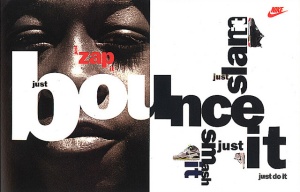
Brand Strategy for Nike – Designed in 1988

This poster has very interesting and attractive fonts but at the same time they can be a little busy and unrecognizable. At first one can’t really read the text right away but has to carefully examine. The designer used opposite colours to make the poster more attractive and unique. The fonts are creating a certain type of flow, movement, sizes, positioning and it may be that the designer created this type of compositions so that the customer gets confused and may want to find out what is written. I can see many similarities between Brody and Marinetti’s work, through the choice of colours, positioning, sizes and compositions.

Filippo Tomaso Marinetti

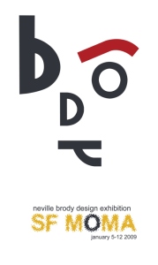
 Basic RGBThe artist created a simple poster by using only two colours on a white background with a typography with different sizes and thickness. He positioned and manipulated these fonts to make them look like a face but at the same time that face spells out his name.
neville-brody-1 (1)

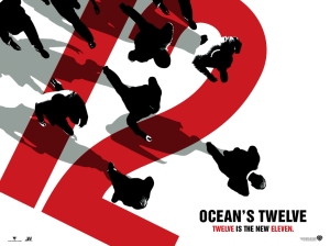
Ocean’s Twelve Poster, Neville Brody 2004

In this poster I can see that it is in a bird’e eye view and it includes two colours, red and black on a white background. It might be that these bold colours could be influenced from the Japanese Prints. The composition that he created is linear, how hhe placed the people and the font you can tell that there is movement from the upper left to the lower right.

References

Inkbot Design, (2014). Neville Brody | Famous Graphic Designer Work & Quotes. [online] Available at: http://inkbotdesign.com/neville-brody/ [Accessed 16 Apr. 2015].

Fontfont.com, (2015). Designers: Neville Brody. [online] Available at:https://www.fontfont.com/designers/neville-brody [Accessed 2 Apr. 2015].

Futurism

Futurism started in Italy in the early 20th century.Futurist artists practiced every type of art that included panting, ceramics, sculpture, graphic design, interior design , theater, film, literature, music and architecture.

The futurist painters where very successful but most of the ideas of the movement where gained from writing and other factors. Divisionism was a process that light and colour was represented through dots or geometric forms, that was used. Modern art movements where influenced by futurism which in time graphic design was developed.

Referencing

Flask, D. (2015). Futurism : Design Is History. [online] Designishistory.com. Available at: http://www.designishistory.com/1850/futurism/ [Accessed 25 Mar. 2015].

Victor Baron Horta

Victor Baron Horta was a Belgian architect who was born on the 6th of January 1861. He was an art nuveau architect and trained at the Academie des Beaux-Arts in Brussels. He became a student under the Neoclassical architect Alphonse Balat.

His first building was a four story Hotel which was Hotel Tassel in Brussels and was one of the first Art Nuveau buildings. It was a mix of the Neo-Gothic and the Neo-Rococo style.  An important characteristic of these styles was a hall in the shape of an octagon  with a staircase that led to different level, curved lines, and Art Nuveau characteristics on the façade and on the interior.

After the 1900 Horta made his style more simple by using less decoration and used iron.

Victor Baron Horta, Hotel Tassel, Amsterdam

In this architecture Victor Baron Horta was influenced by, art and crafts movement, nature, French Rococo, Celtic art, Japanese art, Egyptian art and Gothic revival.

References

Encyclopedia Britannica, (2015). Victor, Baron Horta | biography – Belgian architect. [online] Available at: http://www.britannica.com/EBchecked/topic/272460/Victor-Baron-Horta [Accessed 25 Mar. 2015].

Antonio Gaudi

Antonio Gaudi was a Spanish architect; he was born in 25th June 1852 in Reus in Spain. The characteristics of his style where freedom of form, attractive colours and texture and organic forms.  Gaudi worked mostly in the area of Barcelona and most of his carrier was based on the building of the Sagrada Familia.

Antonio Gaudi, Sagrada Familia,Barcelona

Anonio Gaudi, Casa Batillo, Barcelona

Antio Gaudi’s architecture has some similar features to the Gothic architecture. This artist may have had many influences from Gothic architecture.

References

Encyclopedia Britannica, (2014). Antoni Gaudi | biography – Spanish architect. [online] Available at: http://www.britannica.com/EBchecked/topic/226989/Antoni-Gaudi [Accessed 25 Mar. 2015].

Art Nuveau

Art Nuveau was a movement that influenced decorative arts and architecture in the late 19th and early 20th centuries. It interested artists throughout Europe and there where a large variety of styles. It was aimed to modernize design and to remove the eclectic historical style that had been popular in earlier years.

Artists where inspired from both organic and geometric forms, that where evolved in elegant designs that merged flowing natural forms with angular contours. The style was no longer popular after it gave way to art deco in the 1920s but was revived in the 1960s and is currently an important prototype of modernism.

Art Nuveau has some similar elements that in my opinion resemble Celtic art.

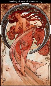
Dance-large

Dance

Alphonse Maria Mucha

autumn-queen-cristina-mcallister

Autumn Queen, Cristina McAllister, Painting – Original Digital Art

References

The Art Story, (2015). Art Nouveau Movement, Artists and Major Works. [online] Available at: http://www.theartstory.org/movement-art-nouveau.htm [Accessed 12 Mar. 2015].

Henri de Toulouse – Lautrec

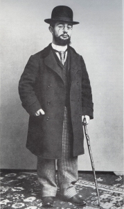
henri-de-toulouse-lautrec-1892Henri de Toulouse-Lautrec was an aristocratic dwarf; he created art that reflected his life. His posters promoted Montmartre entertainers as celebrities and helped to elevate the medium of advertising. His paintings where very personal and humanistic and revealed the emotions hidden beneath rice powder and gaslights. Although he died at a young age of alcoholism and syphilis he remained a great influence.
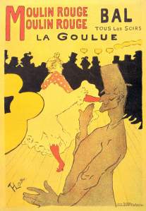
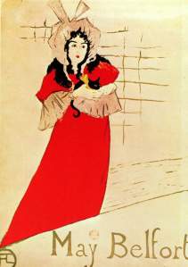
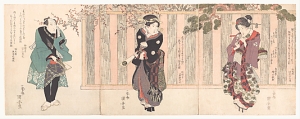
The content of his posters where influenced by Japanese ukiyo-e prints. A poster of May Belfort that he made can be compared with the figure of Iwai Hanshiro V in ‘Three Kabuki actors’ by Utagawa Kuniyasu.

MHenri_de_Toulouse-Lautrec_049oulin Rouge: La Goulue (1891)

Artist: Henri de Toulouse-Lautrecjardin-de-paris-may-belfort-plakat-1883

Completion Date: 1883

Style: Art Nouveau (Modern)

Genre: portrait

Dimensions: 130 x 95 cm

Gallery: Yale University Art Gallery, New Haven, Connecticut, USA

three-kabuki-actors-playing-hanetsuki-utagawa-kuniyasu-japanese-1794e280931834-via-the-met

Three Kabuki Actors Playing Hanetsuki, Utagawa Kuniyasu, c. 1823

References

Metmuseum.org, (2015). Henri de Toulouse-Lautrec (1864–1901) | Thematic Essay | Heilbrunn Timeline of Art History | The Metropolitan Museum of Art. [online] Available at: http://www.metmuseum.org/toah/hd/laut/hd_laut.htm [Accessed 12 Mar. 2015].

Japonisme

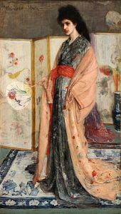
In 1853 Japanese ports reopened to trade with the West. At this time there was a tidal of foreign imports that flooded the European shores. It was here that there were woodcut prints masters from the ukiyo-e school that transformed Impressionist and Post-Impressionist art by showing that simple, transitory, everyday subjects from ‘the floating world’ that could be presented in a decorative way.

James Whistler discovered Japanese prints in a Chinese tearoom near London Bridge; Claude Monet first saw these prints when he used them as wrapping paper in a spice shop in Holland.

250px-James_McNeill_Whistler_-_La_Princesse_du_pays_de_la_porcelaine_-_brighter

Artist     James McNeill Whistler

Year       1865

Type      Oil on canvas

Dimensions        201.5 cm × 116.1 cm (79.3 in × 45.7 in)

Location               Freer Gallery of Art, Washington, D.C.

Accession            F1903.91a-b

References

Metmuseum.org, (2015). Japonisme | Thematic Essay | Heilbrunn Timeline of Art History | The Metropolitan Museum of Art. [online] Available at: http://www.metmuseum.org/toah/hd/jpon/hd_jpon.htm [Accessed 12 Mar. 2015].

William Morris

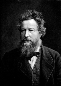
Wmmorris3248William Morris was born on the 24th of March 1834 and died 3rd October 1896. He was an English textile designer, artist, writer and socialist. He had trained as an architect and always wanted to be a painter. When he was a student at Oxford he met the artist Edward Burne-Jones. Together with Ruskin, they founded the Arts and Craft Movement.

In the 1860s he decided that he decided to continue advancing in the field of decorative arts. His career as a designer began when he first decorated the Red House which was built for him by Phillip Webb.

The success of his work led to the formation of Morris, Marshall, Faulkner & Co. in 1861. It was very well known for its stained glass and most of them can be seen in churches throughout Britain.

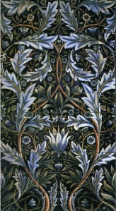
membland_tile_panel

Title

      : William Morris Membland Tile Panel

Mural: 66 tiles (60 six-inch tiles, and 6 6×3 inch tiles)

Tile: Ceramic

Base Color: Indigo

Size: six-inch square tiles (15.4 cm), 6 x 3 inch tiles (7.2 cm x 15.4 cm)

Thickness: 3/8 inch (1 cm)

Weight: 11.5 ounces (326 grams) each tile

strawberry-thief-william-morris

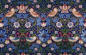
Strawberry Thief, 1883, William Morris (1834-1896) V&A Museum no. T.586-1919

References

Vam.ac.uk, (2015). William Morris – Victoria and Albert Museum. [online] Available at: http://www.vam.ac.uk/page/w/william-morris/ [Accessed 10 Mar. 2015].

Morrissociety.org, (2015). “A Brief Biography of William Morris” by Nicholas Salmonm – The William Morris Society U.S.. [online] Available at: http://www.morrissociety.org/morris/bio-salmon.html [Accessed 10 Mar. 2015].

Josiah Wedgwood

Wedgwood was and English potter who made some of the finest ceramic art. He was born in Burslem, Staffordshire on the 12th July 1730. His family also had a long tradition of potters. After the death of his father at the age of nine he worked in his family’s pottery.

In 1759 he set up his own pottery works in Burslem. His pottery was so high quality that the Queen Charlotte appointed him royal supplier of dinnerware in 1762.

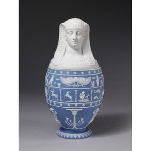
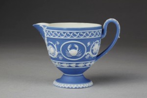
In 1754 Wedgwood began experimenting with coloured cream ware.  He also made red stone ware; basaltes ware, an unglazed black stoneware; and jasperware, made of white stoneware clay that had been coloured by adding metal oxides.  Jasperware was usually ornamented with white relief of Greek portraits or scenes.  He used fine pearl ware which was pale cream ware with a blue tint to the glaze.

Wedgwood’s basalt, a hard, black, stone-like material known also as Egyptian ware or basaltes ware, was used for vases, candlesticks, and realistic busts of historical figures.  Jasper ware was his most successful innovation, it was a durable unglazed ware and was blue with fine white cameo figures which were inspired by the ancient roman vases.

2006AA6505_jpg_ds CIS:1275-1855

References

Famous Potters of Stoke-on-Trent, 2009 [online] Available at: <http://www.thepotteries.org/potters/wedgwood.htm&gt; [Accessed on 25 February 2015]